记录 CSS 相关的小 Tips,琐碎却常用!
快速重置表单元素:unset
原始的 button 按钮要重置挺麻烦的。洋洋洒洒的要设置好几个属性,就像下面这样:
button {
  padding: 0;
  outline: none;
  border: none;
  background: none;
  color: inherit;
  font: inherit;
}
其实你只需要这样就可以(像平时用的特别多的 input、textarea):
button { all: unset; }扩展:
all 属性用于重置所有属性(除了 unicode-bidi 和 direction)。

语法:
all: initial | inherit | unset;

默认值:none

属性值:
initial	修改所有元素属性或父元素的值为其初始化值
inherit	修改所有元素属性或父元素的值为其父元素的值
unset	修改所有元素属性或父元素的值为其父元素的值(如果有继承)或其初始值
文本溢出省略号
单行:
div {
  white-space: nowrap;
  overflow: hidden;
  text-overflow: ellipsis;
}
多行:
div {
  overflow: hidden;
  text-overflow: ellipsis;
  word-wrap: break-word;
  display: -webkit-box; /* 将对象作为弹性伸缩盒子模型显示 */
  -webkit-line-clamp: 4; /* 控制最多显示几行 */
  -webkit-box-orient: vertical; /* 设置或检索伸缩盒对象的子元素的排列方式 */
}
改变滚动条样式
滚动条的组成分为三个部分:
- 滚动条容器
scrollbar - 滚筒条轨道
scrollbar-track - 滚动条滑块
scrollbar-thumb
div::-webkit-scrollbar {
  /* 这里的宽是指竖向滚动条的宽,高是指横向滚动条的高 */
  width: 16px;
  height: 16px;
  background: pink;
}

div::-webkit-scrollbar-thumb {
  border-radius: 10px;
  background:
  linear-gradient(red,orange);
}
选择器匹配非最后一个元素
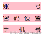
div:not(:last-child) /* 匹配非最后一个 div 元素的 div 元素 */设置文本两端对齐
div {
  width: 100px;
  background-color: pink;
  margin-bottom: 10px;
  text-align-last: justify; /* 这是关键属性 */
}

<div>账号</div>
<div>密码设置</div>
<div>手机号</div>
规定图像展示方式
显示图片的时候会遇到这种问题,对面返回的图片宽高比例是不一样的。但是设置的容器大小是一样的,这个时候需要让图片保持比例最大填充容器
object-fit:fill | contain | cover | none | scale-down
多边框效果实现
使用 box-shadow 和 outline 属性实现多边框效果:
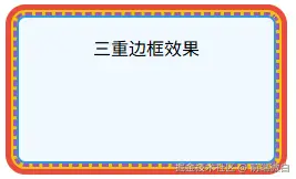
.multi-borders {
  position: relative;
  width: 200px;
  height: 100px;
  background: #f0f8ff;
  border: 2px solid #3498db;
  border-radius: 8px;
  margin: 20px auto;
  padding: 15px;
  text-align: center;

  /* 使用 box-shadow 创建两个边框 */
  box-shadow:
    0 0 0 5px #f1c40f,
    0 0 0 10px #e74c3c;

  /* 使用 outline 创建第三个边框 */
  outline: 3px dashed #9b59b6;
}
元素居中
普通文档流元素
.center {
  width: 300px;
  height: 200px;

  /* Flexbox 方案 - 现代浏览器首选 */
  display: flex;
  justify-content: center;
  align-items: center;

  /* Grid 方案 - 最简方式 */
  display: grid;
  place-items: center;

  /* 传统方法 - 固定宽高 */
  position: relative;
  left: 50%;
  top: 50%;
  transform: translate(-50%, -50%);
}
浮动元素
/* 清除浮动 */
.float-container::after {
  content: "";
  display: table;
  clear: both;
}

.float-center {
  float: left;
  position: relative;
  left: 50%;
  transform: translateX(-50%);
}
绝对定位元素
.absolute-center {
  position: absolute;

  /* 视口居中 */
  top: 0;
  right: 0;
  bottom: 0;
  left: 0;
  margin: auto;

  /* 已知尺寸居中 */
  top: 50%;
  left: 50%;
  transform: translate(-50%, -50%);

  /* 容器内居中 */
  inset: 0;
  margin: auto;
}