1 - 正方形
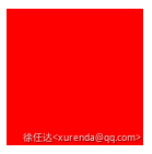
.square {
  width: 100px;
  height: 100px;
  background-color: #f00;
}
2 - 长方形
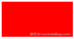
.rectangle {
  width: 200px;
  height: 100px;
  background-color: #f00;
}
3 - 圆形
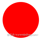
.circle {
  width: 100px;
  height: 100px;
  background-color: #f00;
  border-radius: 50%;
}
4 - 椭圆形
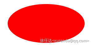
.oval {
  width: 200px;
  height: 100px;
  background-color: #f00;
  border-radius: 100px / 50px;
}
5 - 上三角
下三角、左三角、右三角同理
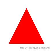
.triangle-up {
  width: 0;
  height: 0;
  border-left: 50px solid transparent;
  border-right: 50px solid transparent;
  border-bottom: 100px solid #f00;
}
6 - 左上角
右上角、左下角、右下角同理
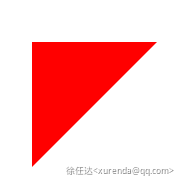
.triangle-topleft {
  width: 0;
  height: 0;
  border-top: 100px solid #f00;
  border-right: 100px solid transparent;
}
7 - 箭头

.curvedarrow {
  position: relative;
  width: 0;
  height: 0;
  border-top: 9px solid transparent;
  border-right: 9px solid #f00;
  transform: rotate(10deg);
}
.curvedarrow::after {
  content: '';
  position: absolute;
  border: 0px solid transparent;
  border-top: 3px solid #f00;
  border-radius: 20px 0 0 0;
  top: -12px;
  left: -9px;
  width: 12px;
  height: 12px;
  transform: rotate(45deg);
}
8 - 梯形
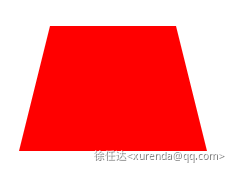
.trapezoid {
  border-bottom: 100px solid #f00;
  border-left: 25px solid transparent;
  border-right: 25px solid transparent;
  height: 0;
  width: 100px;
}
9 - 平行四边形
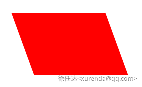
.parallelogram {
  width: 150px;
  height: 100px;
  transform: skew(20deg);
  background-color: #f00;
}
10 - 六角形
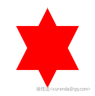
.star-six {
  position: relative;
  width: 0;
  height: 0;
  border-left: 50px solid transparent;
  border-right: 50px solid transparent;
  border-bottom: 100px solid #f00;
}
.star-six::after {
  content: '';
  position: absolute;
  top: 30px;
  left: -50px;
  width: 0;
  height: 0;
  border-left: 50px solid transparent;
  border-right: 50px solid transparent;
  border-top: 100px solid #f00;
}
11 - 五角形
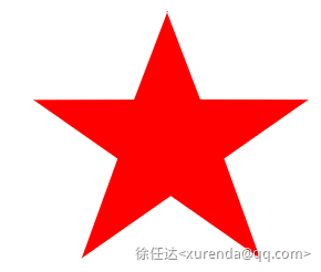
.star-five {
position: relative;
display: block;
margin: 50px 0;
color: #f00;
width: 0;
height: 0;
border-left: 100px solid transparent;
border-right: 100px solid transparent;
border-bottom: 70px solid #f00;
transform: rotate(35deg);
}
.star-five::before {
content: '';
position: absolute;
display: block;
border-bottom: 80px solid #f00;
border-left: 30px solid transparent;
border-right: 30px solid transparent;
height: 0;
width: 0;
top: -45px;
left: -65px;
transform: rotate(-35deg);
}
.star-five::after {
content: '';
position: absolute;
display: block;
color: #f00;
border-bottom: 70px solid #f00;
border-left: 100px solid transparent;
border-right: 100px solid transparent;
height: 0;
width: 0;
top: 3px;
left: -105px;
transform: rotate(-70deg);
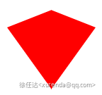
}12 - 五边形
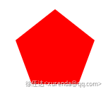
.pentagon {
  position: relative;
  width: 54px;
  border-width: 50px 18px 0;
  border-style: solid;
  border-color: #f00 transparent;
}
.pentagon::before {
  content: '';
  position: absolute;
  height: 0;
  width: 0;
  top: -85px;
  left: -18px;
  border-width: 0 45px 35px;
  border-style: solid;
  border-color: transparent transparent #f00;
}
13 - 六边形
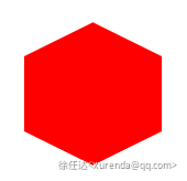
.hexagon {
  width: 100px;
  height: 55px;
  background: red;
  position: relative;
}
.hexagon::before {
  content: '';
  position: absolute;
  top: -25px;
  left: 0;
  width: 0;
  height: 0;
  border-left: 50px solid transparent;
  border-right: 50px solid transparent;
  border-bottom: 25px solid red;
}
.hexagon::after {
  content: '';
  position: absolute;
  bottom: -25px;
  left: 0;
  width: 0;
  height: 0;
  border-left: 50px solid transparent;
  border-right: 50px solid transparent;
  border-top: 25px solid red;
}
14 - 八边形
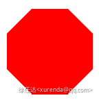
.octagon {
  width: 100px;
  height: 100px;
  background: red;
  position: relative;
}
.octagon::before,
.octagon::after {
  content: '';
  width: 100px;
  height: 0;
  position: absolute;
  left: 0;
  border-left: 29px solid #fff;
  border-right: 29px solid #fff;
  box-sizing: border-box;
}
.octagon::before {
  top: 0;
  border-bottom: 29px solid red;
}
.octagon::after {
  bottom: 0;
  border-top: 29px solid red;
}
15 - 爱心
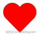
.heart {
  position: relative;
  width: 100px;
  height: 90px;
}
.heart::before,
.heart::after {
  position: absolute;
  content: '';
  left: 50px;
  top: 0;
  width: 50px;
  height: 80px;
  background: red;
  border-radius: 50px 50px 0 0;
  transform: rotate(-45deg);
  transform-origin: 0 100%;
}
.heart::after {
  left: 0;
  transform: rotate(45deg);
  transform-origin: 100% 100%;
}
16 - 无穷大
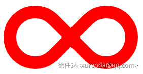
.infinity {
  position: relative;
  width: 212px;
  height: 100px;
  box-sizing: content-box;
}
.infinity::before,
.infinity::after {
  content: '';
  box-sizing: content-box;
  position: absolute;
  top: 0;
  left: 0;
  width: 60px;
  height: 60px;
  border: 20px solid red;
  border-radius: 50px 50px 0 50px;
  transform: rotate(-45deg);
}
.infinity::after {
  left: auto;
  right: 0;
  border-radius: 50px 50px 50px 0;
  transform: rotate(45deg);
}
17 - 菱形
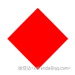
.diamond {
width: 0;
height: 0;
border: 50px solid transparent;
border-bottom-color: red;
position: relative;
top: -50px;
}
.diamond::after {
content: '';
position: absolute;
left: -50px;
top: 50px;
width: 0;
height: 0;
border: 50px solid transparent;
border-top-color: red;
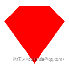
}18 - 钻石一
.diamond-shield {
  width: 0;
  height: 0;
  border: 50px solid transparent;
  border-bottom: 20px solid red;
  position: relative;
  top: -50px;
}
.diamond-shield::after {
  content: '';
  position: absolute;
  left: -50px;
  top: 20px;
  width: 0;
  height: 0;
  border: 50px solid transparent;
  border-top: 70px solid red;
}
19 - 钻石二
.cut-diamond {
  border-style: solid;
  border-color: transparent transparent red transparent;
  border-width: 0 25px 25px 25px;
  height: 0;
  width: 50px;
  box-sizing: content-box;
  position: relative;
  margin: 20px 0 50px 0;
}
.cut-diamond::after {
  content: '';
  position: absolute;
  top: 25px;
  left: -25px;
  width: 0;
  height: 0;
  border-style: solid;
  border-color: red transparent transparent transparent;
  border-width: 70px 50px 0 50px;
}
20 - 鸡蛋
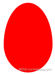
.egg {
  display: block;
  width: 126px;
  height: 180px;
  background-color: red;
  border-radius: 50% 50% 50% 50% / 60% 60% 40% 40%;
}
21 - 吃豆人
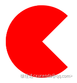
.pacman {
  width: 0px;
  height: 0px;
  border-right: 60px solid transparent;
  border-top: 60px solid red;
  border-left: 60px solid red;
  border-bottom: 60px solid red;
  border-top-left-radius: 60px;
  border-top-right-radius: 60px;
  border-bottom-left-radius: 60px;
  border-bottom-right-radius: 60px;
}
22 - 对话泡泡
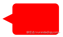
.talkbubble {
  width: 120px;
  height: 80px;
  background: red;
  position: relative;
  -moz-border-radius: 10px;
  -webkit-border-radius: 10px;
  border-radius: 10px;
}
.talkbubble::before {
  content: '';
  position: absolute;
  right: 100%;
  top: 26px;
  width: 0;
  height: 0;
  border-top: 13px solid transparent;
  border-right: 26px solid red;
  border-bottom: 13px solid transparent;
}
23 - 十二齿齿轮
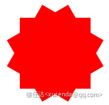
.burst-12 {
  background: red;
  width: 80px;
  height: 80px;
  position: relative;
  text-align: center;
}
.burst-12::before,
.burst-12::after {
  content: '';
  position: absolute;
  top: 0;
  left: 0;
  height: 80px;
  width: 80px;
  background: red;
}
.burst-12::before {
  transform: rotate(30deg);
}
.burst-12::after {
  transform: rotate(60deg);
}
24 - 八齿齿轮
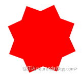
.burst-8 {
  background: red;
  width: 80px;
  height: 80px;
  position: relative;
  text-align: center;
  transform: rotate(20deg);
}
.burst-8::before {
  content: '';
  position: absolute;
  top: 0;
  left: 0;
  height: 80px;
  width: 80px;
  background: red;
  transform: rotate(135deg);
}
25 - 太极
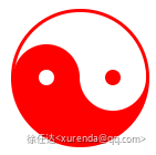
.yin-yang {
  width: 96px;
  box-sizing: content-box;
  height: 48px;
  background: #fff;
  border-color: red;
  border-style: solid;
  border-width: 2px 2px 50px 2px;
  border-radius: 100%;
  position: relative;
}
.yin-yang::before {
  content: '';
  position: absolute;
  top: 50%;
  left: 0;
  background: #fff;
  border: 18px solid red;
  border-radius: 100%;
  width: 12px;
  height: 12px;
  box-sizing: content-box;
}
.yin-yang::after {
  content: '';
  position: absolute;
  top: 50%;
  left: 50%;
  background: red;
  border: 18px solid #fff;
  border-radius: 100%;
  width: 12px;
  height: 12px;
  box-sizing: content-box;
}
26 - 徽章丝带
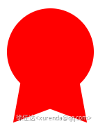
.badge-ribbon {
  position: relative;
  background: red;
  height: 100px;
  width: 100px;
  border-radius: 50px;
}
.badge-ribbon::before,
.badge-ribbon::after {
  content: '';
  position: absolute;
  border-bottom: 70px solid red;
  border-left: 40px solid transparent;
  border-right: 40px solid transparent;
  top: 70px;
  left: -10px;
  transform: rotate(-140deg);
}
.badge-ribbon::after {
  left: auto;
  right: -10px;
  transform: rotate(140deg);
}
27 - 太空入侵者
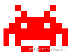
.space-invader {
  box-shadow:
    0 0 0 1em red,
    0 1em 0 1em red,
    -2.5em 1.5em 0 .5em red,
    2.5em 1.5em 0 .5em red,
    -3em -3em 0 0 red,
    3em -3em 0 0 red,
    -2em -2em 0 0 red,
    2em -2em 0 0 red,
    -3em -1em 0 0 red,
    -2em -1em 0 0 red,
    2em -1em 0 0 red,
    3em -1em 0 0 red,
    -4em 0 0 0 red,
    -3em 0 0 0 red,
    3em 0 0 0 red,
    4em 0 0 0 red,
    -5em 1em 0 0 red,
    -4em 1em 0 0 red,
    4em 1em 0 0 red,
    5em 1em 0 0 red,
    -5em 2em 0 0 red,
    5em 2em 0 0 red,
    -5em 3em 0 0 red,
    -3em 3em 0 0 red,
    3em 3em 0 0 red,
    5em 3em 0 0 red,
    -2em 4em 0 0 red,
    -1em 4em 0 0 red,
    1em 4em 0 0 red,
    2em 4em 0 0 red;
  background: red;
  width: 1em;
  height: 1em;
  overflow: hidden;
  margin: 50px 0 70px 65px;
}
28 - 电视
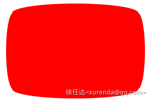
.tv {
  position: relative;
  width: 200px;
  height: 150px;
  margin: 20px 0;
  background: red;
  border-radius: 50% / 10%;
  color: white;
  text-align: center;
  text-indent: .1em;
}
.tv::before {
  content: '';
  position: absolute;
  top: 10%;
  bottom: 10%;
  right: -5%;
  left: -5%;
  background: inherit;
  border-radius: 5% / 50%;
}
29 - 雪佛龙
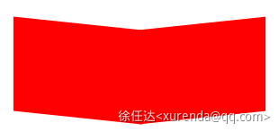
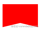
.chevron {
  position: relative;
  text-align: center;
  padding: 12px;
  margin-bottom: 6px;
  height: 60px;
  width: 200px;
}
.chevron::before {
  content: '';
  position: absolute;
  top: 0;
  left: 0;
  height: 100%;
  width: 51%;
  background: red;
  transform: skew(0deg, 6deg);
}
.chevron::after {
  content: '';
  position: absolute;
  top: 0;
  right: 0;
  height: 100%;
  width: 50%;
  background: red;
  transform: skew(0deg, -6deg);
}
30 - 放大镜
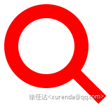
.magnifying-glass {
  font-size: 10em;
  display: inline-block;
  width: 0.4em;
  box-sizing: content-box;
  height: 0.4em;
  border: 0.1em solid red;
  position: relative;
  border-radius: 0.35em;
}
.magnifying-glass::before {
  content: '';
  display: inline-block;
  position: absolute;
  right: -0.25em;
  bottom: -0.1em;
  border-width: 0;
  background: red;
  width: 0.35em;
  height: 0.08em;
  transform: rotate(45deg);
}
31 - Facebook图标

.facebook-icon {
  background: red;
  text-indent: -999em;
  width: 100px;
  height: 110px;
  box-sizing: content-box;
  border-radius: 5px;
  position: relative;
  overflow: hidden;
  border: 15px solid red;
  border-bottom: 0;
}
.facebook-icon::before {
  content: '/20';
  position: absolute;
  background: red;
  width: 40px;
  height: 90px;
  bottom: -30px;
  right: -37px;
  border: 20px solid #fff;
  border-radius: 25px;
  box-sizing: content-box;
}
.facebook-icon::after {
  content: '/20';
  position: absolute;
  width: 55px;
  top: 50px;
  height: 20px;
  background: #fff;
  right: 5px;
  box-sizing: content-box;
}
32 - 月亮
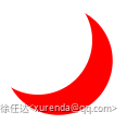
.moon {
  width: 80px;
  height: 80px;
  border-radius: 50%;
  box-shadow: 15px 15px 0 0 red;
}
33 - 旗
.flag {
  width: 110px;
  height: 56px;
  box-sizing: content-box;
  padding-top: 15px;
  position: relative;
  background: red;
  color: white;
  font-size: 11px;
  letter-spacing: 0.2em;
  text-align: center;
  text-transform: uppercase;
}
.flag::after {
  content: '';
  position: absolute;
  left: 0;
  bottom: 0;
  width: 0;
  height: 0;
  border-bottom: 13px solid #fff;
  border-left: 55px solid transparent;
  border-right: 55px solid transparent;
}
34 - 圆锥
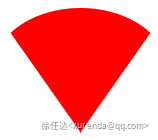
.cone {
  width: 0;
  height: 0;
  border-left: 70px solid transparent;
  border-right: 70px solid transparent;
  border-top: 100px solid red;
  border-radius: 50%;
}
35 - 十字架
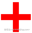
.cross {
  background: red;
  height: 100px;
  position: relative;
  width: 20px;
}
.cross::after {
  content: '';
  background: red;
  height: 20px;
  left: -40px;
  position: absolute;
  top: 40px;
  width: 100px;
}
36 - 根基
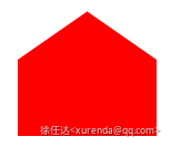
.base {
  background: red;
  display: inline-block;
  height: 55px;
  margin-left: 20px;
  margin-top: 55px;
  position: relative;
  width: 100px;
}
.base::before {
  content: '';
  border-bottom: 35px solid red;
  border-left: 50px solid transparent;
  border-right: 50px solid transparent;
  height: 0;
  left: 0;
  position: absolute;
  top: -35px;
  width: 0;
}
37 - 指示器

.pointer {
  width: 200px;
  height: 40px;
  position: relative;
  background: red;
}
.pointer::after {
  content: '';
  position: absolute;
  left: 0;
  bottom: 0;
  width: 0;
  height: 0;
  border-left: 20px solid white;
  border-top: 20px solid transparent;
  border-bottom: 20px solid transparent;
}
.pointer::before {
  content: '';
  position: absolute;
  right: -20px;
  bottom: 0;
  width: 0;
  height: 0;
  border-left: 20px solid red;
  border-top: 20px solid transparent;
  border-bottom: 20px solid transparent;
}
38 - 锁

.lock {
  font-size: 8px;
  position: relative;
  width: 18em;
  height: 13em;
  border-radius: 2em;
  top: 10em;
  box-sizing: border-box;
  border: 3.5em solid red;
  border-right-width: 7.5em;
  border-left-width: 7.5em;
  margin: 0 0 6rem 0;
}
.lock::before {
  content: '';
  box-sizing: border-box;
  position: absolute;
  border: 2.5em solid red;
  width: 14em;
  height: 12em;
  left: 50%;
  margin-left: -7em;
  top: -12em;
  border-top-left-radius: 7em;
  border-top-right-radius: 7em;
}
.lock::after {
  content: '';
  box-sizing: border-box;
  position: absolute;
  border: 1em solid red;
  width: 5em;
  height: 8em;
  border-radius: 2.5em;
  left: 50%;
  top: -1em;
  margin-left: -2.5em;
}