我们知道浏览器自带的 checkbox 复选框和 radio 单选框不怎么美观,而且在不同的浏览器上显示的样式又有很大的差异,由于目前越来越多的人开始接受支持 CSS3 的现代浏览器,所以今天就简单的用一些 CSS3 代码来自定义 checkbox 和 radio 的显示方式。
实现思路
- 原理很简单,先把页面上
<input type="checkbox">的display设置为none,从而把它隐藏掉,然后利用 CSS3 代码来绘制与checkbox(radio)相连的label元素,用label来模拟checkbox(radio)。 - 另外,我们可以利用伪元素
::before和::after给label添加样式,利用 CSS3 的伪类选择器:checked,:hover,:focus,:disabled设置不同状态的样式。
示例
1.自定义 checkbox(样式1)
效果图:
.png)
演示地址:
HTML 代码:
<input type="checkbox" id="chk">
<label for="chk"></label>
CSS 代码:
#chk {
    display: none;  /* 将原生的checkbox隐藏 */
}

/* label 模拟 “划动条” */
#chk + label {
    position: relative;
    display: inline-block;
    width: 60px;
    height: 20px;
    border-radius: 10px;
    background-color: #bbb;
}

/* “label::before伪元素 模拟 “划块” */
#chk + label:before {
    content: '';
    cursor: pointer;
    position: absolute;
    top: -5px;
    left: 0;
    z-index: 99;
    width: 30px;
    height: 30px;
    border-radius: 50%;
    background: #F7F4F4;
    box-shadow: 0 3px 1px rgba(0,0,0,0.05), 0 0px 1px rgba(0,0,0,0.3);
    -webkit-transition: all 0.1s ease-in;
    transition: all 0.1s ease-in;
}

/* checkbox选中状态时,“划动条”的样式 */
#chk:checked + label {
    background: #aabbfd;
}

/* checkbox选中状态时,“划块”的样式 */
#chk:checked + label:before {
    content: '';
    position: absolute;
    left: 30px;
    background-color: #4ea5dd;
}
2.自定义 checkbox(样式2)
效果图:
.png)
演示地址:
HTML 代码:
<input type="checkbox" id="chk">
<label for="chk"></label>
CSS 代码:
#chk {
    display: none;  /* 将原生的checkbox隐藏 */
}

/* label 模拟 “划动条” */
#chk + label {
    display: inline-block;
    position: relative;
    width: 65px;
    height: 30px;
    border-radius: 10px;
    background-color: #F7836D;
    box-shadow: inset 0 0 20px rgba(0, 0, 0, 0.1), 0 0 10px rgba(146, 196, 245, 0.4);
}

/* “label::before伪元素 模拟 “划块” */
#chk + label:before {
    content: '';
    cursor: pointer;
    position: absolute;
    top: -1px;
    left: 0;
    z-index: 99;
    width: 20px;
    height: 32px;
    border-radius: 7px;
    background: #fff;
    box-shadow: 0 0 1px rgba(0,0,0,0.6);
}

/* “label::after伪元素 模拟 “OFF/ON文字” */
#chk + label:after {
    content: 'OFF';
    position: absolute;
    top: 0;
    left: 30px;
    width: 50%;
    text-align: left;
    font-size: 12px;
    line-height: 30px;
    color: #fff;
}

/* checkbox选中状态时,“划动条”的样式 */
#chk:checked + label {
    background-color: #4cda60;
}

/* checkbox选中状态时,“划块”的样式 */
#chk:checked + label:before {
    content: '';
    position: absolute;
    left: 45px;
}

/* checkbox选中状态时,“OFF/ON文字”的样式 */
#chk:checked + label:after {
    content: 'ON';
    left: 0;
    text-align: right;
}

/* 点击时,缓动动画过渡 */
#chk + label:before,#chk + label:after,#chk + label {
    -webkit-transition: all 0.1s ease-in;
    transition: all 0.1s ease-in;
}
3.自定义 radio
效果图:
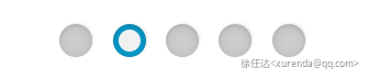
演示地址:
HTML 代码:
<input type="radio" name="rd" class="rd" id="rd1">
<label for="rd1"></label>
<span style="margin-right: 10px;"></span>
<input type="radio" name="rd" class="rd" id="rd2" checked>
<label for="rd2"></label>
<span style="margin-right: 10px;"></span>
<input type="radio" name="rd" class="rd" id="rd3">
<label for="rd3"></label>
CSS 代码:
.rd {
    display: none;  /* 将原生的radio隐藏 */
}

/* label 模拟 “底部框” */
.rd + label {
    display: inline-block;
    position: relative;
    cursor: pointer;
    width: 24px;
    height: 24px;
    border-radius: 50%;
    background-color: #cecece;
    box-shadow: 0 1px 15px rgba(0, 0, 0, 0.1) inset, 0 1px 4px rgba(0, 0, 0, 0.1) inset, 1px -1px 2px rgba(0, 0, 0, 0.1);
}

/* “label::before伪元素 模拟 “选择小圆块” */
.rd + label:before {
    content: '';
    position: absolute;
    top: 12px;
    left: 12px;
    z-index: 500;
    width: 0;
    height: 0;
    border-radius: 50%;
    background: #f1f1f1;
    -webkit-transition: all 0.15s ease-in;
    transition: all 0.15s ease-in;
}

/* radio选中状态时,“底部框”的样式 */
.rd:checked + label {
    background: #059acb;
}

/* radio选中状态时,“选择小圆块”的样式 */
.rd:checked + label:before {
    content: '';
    position: absolute;
    top: 4px;
    left: 4px;
    width: 16px;
    height: 16px;
}